The Uninvited

- The font used stands out against the black background as it's bold and white. My group and I will be using a similar font and background colour scheme as this is similar to what we used in out trailer for the titles.
- The black and white image ensures focus on th text but also the subject of the image. Black and white film posters can usually give away the genre of the film, usually being a horror film.
- The type of image that is used, faceless person, gives a mysterious feeling to the audience by how the image is shown (person looking through the window)
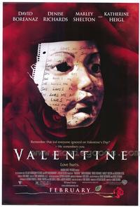
Valentine

- The use of red for the background colour indicates danger and stands out bright and clear to the viewes
- The use of white writing throughout the poster and in capital letters 'VALENTINE' under the main image and stands out clearly against the red background
- The main image on the poster shows a scary figure, possibly being a mask of a young child
- At the bottom of the poster, the month as to when the film will be released is shown however, it is not giving the exact date as to when the film will be out in cinemas. This is a feature which my group and I will be using in our own film poster
One Missed Call
- Dark background which means the image, font, colour of the writing (white and red) on the poster stands out to draw the audiences eye
- A quote is quoted at the top of the poster to enitse the viewers in, by which is makes the audience more interested in the film and are being persuaded to watch the film and also by the use of red that is used, indicates danger
- The strange and horrific image on the front of the poster indicates that the person is wearing a mask which ticks of the stereotypical conventions of a horror film
Let Me In

- The poster contains ice as the background which gives a feeling of innocense to the audience and black letters in capital letters for the writing, also having the word 'ME' in blood staines which catch's the audience's eye instantly which means danger, the red also stands out a lot more when it is up against a white background
- The poster doesn't contain too much information about the film compared to other film posters that I have analyses, only the director is produced onto the poster, this could mean that the poster had been released early when they were still in the progress of making the film or could mean that they did not want to unvail too much information about the film
Paranormal Activity

- The poster contains red font infront of a black background, by which it gives a feeling of danger which is shown throughout this film
- The image across the middle of the poster has been edited to tinted blue, also showing the main comvention of this film is that it's filmed on a home video camera, which gives the film a more realistic approach
- At the top of poster there are quotations which are to make the viewers become more interested in the film, also by having quotations on a poster it informers the viewer that this film is worth seeing
- 'In Cinemas November 25' is indicated in white at the bottom of the poster, the rest of the writing is in red, however this stands out from all the other writing because it is clear and shows to the audience when the film will be released to watch, this is a good feature to have on a poster

No comments:
Post a Comment